Case study · Education platform
ScholarQuest
A digital front door for study-abroad counselling — destinations, test prep, and expert support in one coherent experience.
- Product
- Education consultancy web platform
- Problem
- Fragmented student journey across destinations and prep
- My role
- IA, product design, and platform build
- Outcome
- Live counselling front door with structured inquiry
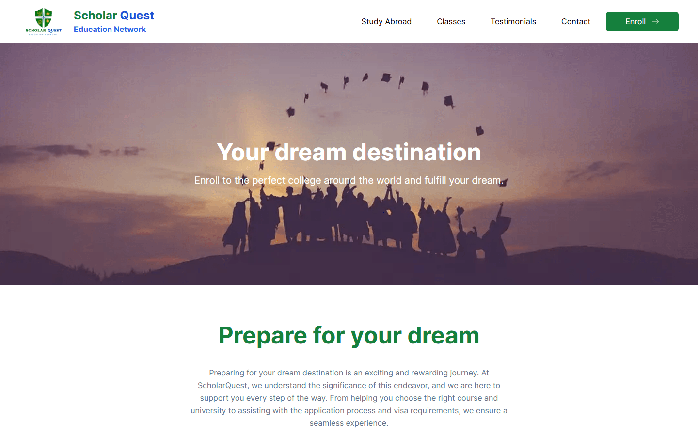
What to notice Destination and prep paths resolve into one inquiry flow for advisers.
Timeline
From brochure site to counselling platform.
Challenge
High-stakes decisions, scattered information.
Students choosing where to study abroad face fragmented advice — social media, agents, and generic university pages. Consultancies need a platform that builds trust quickly while routing serious inquiries to human experts.
The product had to feel aspirational without becoming empty marketing: clear destinations, preparation pathways, and a frictionless way to start an application conversation.
Solution
One coherent counselling journey online.
ScholarQuest organizes study-abroad guidance into destination hubs, preparation programs, and structured inquiry flows — aspirational enough to inspire, concrete enough to start a conversation with a counsellor.
The live platform at scholarquest.com.np gives the consultancy a credible digital front door instead of scattered social posts and PDF brochures.
User Story
From scattered advice to one counselling path.
Before
Students pieced together study-abroad advice from social posts, agent WhatsApp threads, and generic university pages. Counsellors received vague “I want to go abroad” messages with no destination, level, or timeline context.
After
Destination hubs and preparation programs give students a structured orientation before the first call. Inquiry forms capture education level, course interest, and target country — counsellors receive leads they can act on instead of open-ended chats.
Decision Log
Structure over spectacle.
Destination hubs over a single long landing page
Decision: Separate country-specific pathways (Australia, New Zealand, Canada, USA) instead of one aspirational homepage.
Reason: Students self-orient by destination first; burying pathways in scroll depth wasted the highest-intent visitors.
Tradeoff: More content to maintain per hub; clearer SEO and counsellor handoff per market.
Structured inquiry fields over open contact forms
Decision: Capture education level, course interest, and destination in the first touch — not a free-text box alone.
Reason: Counselling teams need actionable context before scheduling; vague messages created back-and-forth before any value.
Tradeoff: Slightly higher form friction; materially better lead quality for follow-up.
Embedded trust signals over isolated testimonial carousels
Decision: Place student stories and outcome proof inside destination and program journeys, not only in a footer carousel.
Reason: Trust is earned at the moment of destination comparison — most visitors never scroll to a detached testimonials block.
Tradeoff: Less visual repetition of social proof; higher conversion where decisions actually happen.
Failed Attempts
What did not survive launch.
Blog-first information architecture. An early version treated the site as a content feed. Students could not find clear pathways from aspiration to prep programs to inquiry — navigation felt like browsing articles, not starting a journey.
Multiple competing CTAs on the homepage. We tried hero buttons for every destination and service at once. Click-through scattered and serious inquiries dropped; consolidating to one primary path per section recovered intent.
Architecture
Content-led product with conversion at the core.
- ExperienceDestination hubs (Australia, New Zealand, Canada, USA) with narrative guidance and course framing.
- ProgramsTest preparation and destination-college pathways presented as structured services, not loose blog posts.
- TrustStudent stories and outcome proof integrated into the journey, not isolated in a footer carousel only.
- IntakeInquiry forms capturing education level, course interest, and destination for counsellor follow-up.
Key features
Built for student orientation and counsellor handoff.
- Destination hubsCountry-specific guidance for Australia, New Zealand, Canada, and the USA with course and pathway framing.
- Test preparationStructured prep programs presented as services, not undifferentiated blog content.
- Student storiesOutcome proof woven into the journey where trust is earned early.
- Inquiry captureForms that record education level, course interest, and destination for adviser follow-up.
- SEO structureDiscoverable pages for destinations and programs without sacrificing editorial quality.
Technologies
Stack
Impact
What the platform unlocked.
Clarity
Students can orient around destinations and prep programs before speaking to an adviser.
Pipeline
Structured inquiries replace ad-hoc messaging with fields counselling teams can act on.
Presence
A credible digital brand for a consultancy competing on trust and visa success narratives.
Lessons learned
Aspiration needs structure.
Study-abroad sites fail when they sell dreams without pathways. Separating destinations, prep programs, and inquiry capture let students self-orient before a counsellor call — and gave the team actionable lead data instead of vague messages.
Trust signals work best when embedded in the journey, not relegated to a testimonial carousel nobody scrolls to.