Case study · Legal digital presence
Global Law Associates
A practicing firm needed more than a brochure online — it needed a place to publish legal knowledge and be found for the work it already did.
- Product
- Firm website + legal knowledge publishing
- Problem
- Needed depth and SEO, not a brochure site
- My role
- Design, CMS architecture, and development
- Outcome
- 100+ SEO-ready legal pages in production
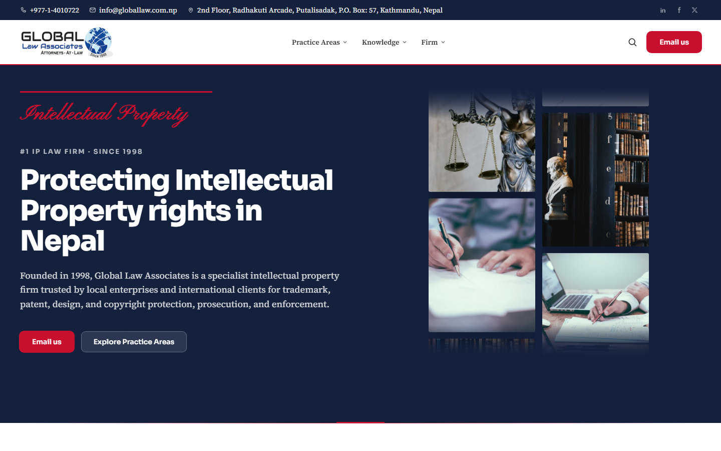
What to notice Publishing structure supports practice areas and knowledge — not a thin marketing shell.
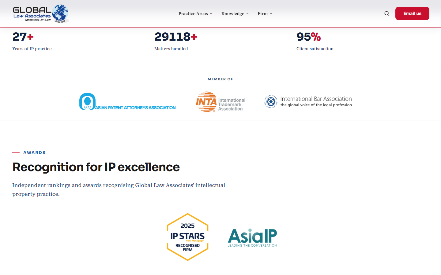
Behind the build
Building a knowledge platform, not just a website
- A problem appeared. A firm needed publishing, not a brochure.
- A system was designed. CMS + knowledge architecture.
- A tradeoff was made. Content depth over marketing chrome.
- A product shipped. Live at globallaw.com.np.
Overview
Practice brand, not a brochure template.
Global Law Associates needed a digital presence that matched the seriousness of IP and corporate work — clear practice areas, professional authority, and space for legal knowledge publishing — without feeling like a generic firm theme.
Role: Design and development of the firm’s corporate website and content architecture.
Timeline
From outdated presence to a durable firm site.
Challenge
Authority without noise.
Law firm sites often collapse into dense menus or stock photography. The challenge was to present IP, corporate, litigation, and foreign investment work with clarity — and leave room for knowledge publishing that builds long-term trust.
Solution
Practice clarity with room to publish.
Global Law Associates received a corporate site with clear practice-area pathways — IP, corporate, litigation, foreign investment — professional people and firm narrative, and a publishing surface for legal knowledge without crowding the primary conversion path.
The live site at globallaw.com.np supports firm communications; the practice also operates IP desks on NepalIPMS.
User Story
From template firm site to practice clarity.
Before
An outdated digital presence with dense menus, generic firm copy, and stock photography that did not reflect IP and corporate practice standards. Knowledge publishing had no dedicated surface — articles lived in ad-hoc PDFs or third-party platforms.
After
Clear practice-area pathways for IP, corporate, litigation, and foreign investment. Editorial visual language with professional people pages and a publishing surface that builds long-term trust without crowding primary navigation.
Decision Log
Authority through structure.
Distinct practice pathways over a single services page
Decision: Separate entry points for IP, corporate, litigation, and investment advisory — not one undifferentiated “Our Services” scroll.
Reason: Visitors arrive with a specific legal question; hunting through generic copy erodes credibility before the first meeting.
Tradeoff: More pages to maintain; faster orientation for high-intent visitors.
Editorial visual language over template firm themes
Decision: Calm hierarchy, typographic authority, and restrained imagery instead of stock-photo hero templates.
Reason: Premium legal brands are judged on seriousness in the first ten seconds — visual noise reads as commodity.
Tradeoff: Less off-the-shelf theme speed; a site that matches practice standards.
Maintainable static front-end over heavy CMS lock-in
Decision: Ship a performance-minded, firm-owned front-end rather than a plugin-heavy CMS the team would fight daily.
Reason: Firms need content ownership without fighting their own publishing stack — launch polish matters less than ongoing control.
Tradeoff: Less drag-and-drop for non-technical editors; faster pages and fewer breaking updates.
Failed Attempts
Layouts that did not ship.
Mega-menu with every service nested. An early IA pass listed every sub-specialty in a hover menu. Visitors lost orientation within seconds — practice clarity required fewer, stronger pathways instead of exhaustive taxonomy.
Stock photography hero treatment. Generic handshake and skyline imagery undermined the premium positioning the firm needed. We moved to editorial typography and authentic firm narrative instead of visual drama.
Architecture
Content structure around practice reality.
- Practice areasClear pathways into IP, corporate, litigation, and investment advisory content.
- People & firmProfessional profiles and firm narrative that support credibility in first meetings.
- PublishingSurface for legal knowledge content without overcrowding the primary conversion path.
- PerformanceModern, maintainable front-end suited to a firm that needs ownership, not CMS lock-in chaos.
Key features
What visitors and the firm need.
- Practice area pagesDistinct pathways for IP, corporate law, litigation, and foreign investment advisory.
- Attorney profilesProfessional people pages that support credibility before first meetings.
- Firm narrativeEditorial visual language — calm hierarchy, no stock-photo filler.
- Knowledge publishingLegal content surface that builds long-term trust without cluttering navigation.
- Responsive performanceFast, maintainable front-end the firm can own without CMS lock-in.
Technologies
Stack
Impact
What shipped.
Brand
A premium digital front door aligned with IP and corporate practice standards.
Clarity
Visitors can orient by practice area instead of hunting through generic firm copy.
Live
Production site at globallaw.com.np supporting ongoing firm communications.
Lessons learned
Authority is editorial, not decorative.
Law firm sites fail when they optimize for visual drama over practice clarity. Separating practice pathways, people, and publishing let the firm communicate expertise without a dense menu or generic template feel.
A maintainable front-end mattered as much as launch-day polish — firms need ownership of content without fighting their own CMS.