Case study · Education consultancy
Sri Education
Educational consultancy platform helping Nepali students with international study opportunities — from counselling to visa-success storytelling.
- Product
- Education consultancy digital platform
- Problem
- High-stakes decisions needed clarity and trust
- My role
- Product design and web platform development
- Outcome
- Live counselling and outcomes-led presence
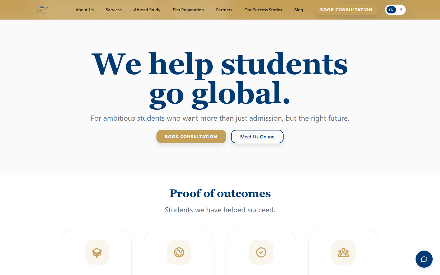
What to notice Outcomes and process share the same surface — students see path and proof together.
Overview
Clarity for high-stakes student decisions.
SRI Educational Consulting needed a platform that communicates outcomes — admissions, destinations, visa success — while guiding students through counselling, applications, and test preparation with honesty and structure.
Role: Product design and web platform development for the consultancy’s digital experience.
Timeline
From ambition to a guided roadmap.
Challenge
Trust is the product.
Study-abroad decisions are expensive and emotional. Families need proof of outcomes and a clear process — not vague promises. The site had to balance aspiration with concrete services: admissions counselling, visa support, accommodation, insurance, and test prep.
Solution
A roadmap-shaped consultancy platform.
Sri Education guides students through counselling, profile evaluation, applications, visa support, and pre-departure — with outcome proof, destination guides, and consultation flows that hand qualified inquiries to counsellors.
The production site at srieducation.com.np balances aspiration with concrete services: admissions, visa, accommodation, insurance, and test prep.
User Story
From vague promises to a visible roadmap.
Before
Families evaluating study abroad saw undifferentiated service lists and aspiration-heavy copy with no clear process. Consultation requests arrived without context — counsellors spent first calls explaining basic steps instead of advising on fit.
After
A roadmap-shaped platform from counselling through pre-departure — outcome proof and visa-success stories where trust is earned, destination guides with pathway framing, and consultation intake that captures where a student is in the journey.
Decision Log
Process beats promises.
Roadmap-shaped IA over flat service list
Decision: Structure the site as a student journey — counselling → applications → visa → pre-departure — with services as modules along the path.
Reason: Families need to see where they are and what comes next; undifferentiated lists feel like every other consultancy.
Tradeoff: Less flexible “everything on one page” marketing; clearer self-qualification before consultation.
Outcome proof early in the journey
Decision: Place visa-success metrics and stories where families evaluate credibility — not buried below the fold.
Reason: Study-abroad decisions are expensive and emotional; proof must appear before aspiration alone carries the page.
Tradeoff: Less minimalist hero design; higher trust at the decision moment.
Consultation intake tied to journey stage
Decision: Capture qualified inquiry context — destination, level, timeline — at the CTA instead of a generic contact form.
Reason: CTAs convert better when visitors already understand which step they are on; counsellors skip repetitive discovery calls.
Tradeoff: Slightly more form fields; materially better follow-up quality.
Failed Attempts
Approaches families rejected.
Aspiration-only homepage without visible process. An early version led with dream imagery and vague “world-class opportunities” copy. Bounce rates stayed high — families wanted to see steps and proof before booking consultation.
Single long-scroll page for every destination. We tried consolidating USA, UK, Australia, and Canada content into one page. Mobile drop-off spiked; destination-specific guides with focused CTAs performed better for both SEO and counsellor handoff.
Architecture
Roadmap-shaped information architecture.
- ProofOutcome metrics and visa-success stories placed where trust is earned early.
- ServicesEnd-to-end offerings from counselling through pre-departure, structured as clear modules.
- DestinationsCountry guides for USA, UK, Australia, Canada, and more — pathway framing, not tourism copy.
- IntakeConsultation and contact flows that hand qualified inquiries to counsellors.
Key features
Built for trust and counsellor handoff.
- Outcome proofVisa-success stories and metrics placed where families evaluate credibility.
- Service modulesCounselling, applications, visa support, accommodation, insurance, and test prep as clear offerings.
- Country guidesDestination pages for USA, UK, Australia, Canada, and more — pathway framing, not tourism copy.
- Student roadmapStep-by-step journey from counselling through pre-departure.
- Consultation intakeContact and inquiry flows that capture qualified leads for counsellor follow-up.
Technologies
Stack
Impact
What the platform delivers.
Clarity
Students see a step-by-step roadmap instead of an undifferentiated service list.
Conversion
Consultation CTAs and inquiry forms support counsellor follow-up.
Live
Production platform at srieducation.com.np for ongoing student acquisition.
Lessons learned
Process beats promises.
Families choosing study abroad need to see a clear process and honest proof — not vague aspiration. Structuring the site as a student roadmap, with services as modules along that path, reduced the undifferentiated service-list problem common in consultancy sites.
Consultation CTAs work best when visitors already understand what step they are on.