Case study · Wellness platform
Yogshala Nepal
A wellness and yoga platform focused on yoga programs, retreats, meditation, and holistic health.
- Product
- Wellness brand and program platform
- Problem
- Calm brand signal without marketplace clutter
- My role
- Design and development of the brand platform
- Outcome
- Live program and retreat presence
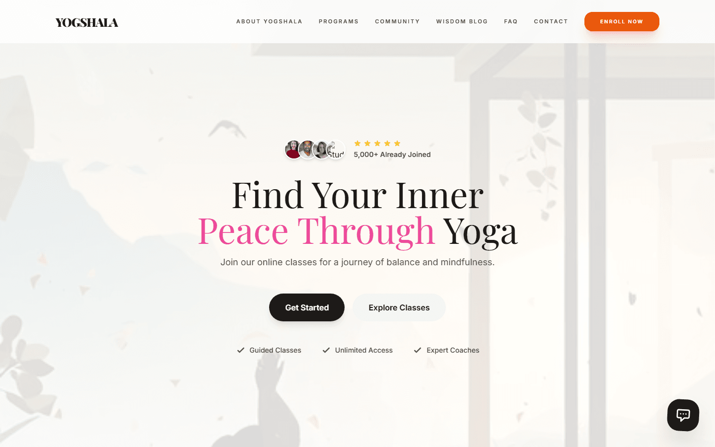
What to notice Atmosphere leads; programs follow without booking-marketplace noise.
Overview
Atmosphere first, then the program path.
Yogshala Nepal needed a digital home that feels calm and grounded — communicating programs, retreats, meditation, and holistic offerings without the clutter of a typical booking marketplace.
Role: Design and development of the wellness brand platform.
Timeline
From brand intent to a living site.
Challenge
Wellness sites that feel noisy fail.
Retreat and yoga brands often over-sell with dense packages and competing CTAs. The design problem was restraint: enough information to choose a program, enough calm to trust the experience.
Solution
Calm discovery, clear program paths.
Yogshala Nepal presents yoga programs, retreats, meditation, and holistic health through an imagery-forward brand surface — enough information to choose a program, enough restraint to trust the experience.
The live platform at yogshala.com.np gives the brand a cohesive digital home instead of fragmented social-only discovery.
User Story
From noisy wellness marketing to calm discovery.
Before
Retreat and program discovery happened through fragmented social posts and competing CTAs — dense package lists, multiple booking buttons, and no cohesive brand home. Mobile visitors researching retreats hit cluttered layouts tuned for desktop.
After
An imagery-forward brand surface that sets calm before program details. Clear pathways for yoga, retreats, meditation, and holistic health — with inquiry flows that respect the tone instead of marketplace-style urgency.
Decision Log
Restraint as the product.
Atmosphere-first layout over feature-heavy landing
Decision: Lead with imagery and typography that establish emotional register before program feature lists.
Reason: Wellness brands are evaluated on trust and calm in the first scroll — dense packages read as hard sell.
Tradeoff: Less immediate information density; higher engagement with program paths.
Program pathways over marketplace-style booking
Decision: Present yoga, retreats, and meditation as clear offerings with inquiry intent — not a comparison grid with instant checkout.
Reason: Retreat decisions are research-heavy; marketplace UX undermined the brand’s grounded positioning.
Tradeoff: Fewer conversion shortcuts; inquiries better matched to program fit.
Single primary inquiry path per section
Decision: One clear contact or booking-intent CTA per program area instead of competing buttons throughout the page.
Reason: Multiple CTAs created urgency that conflicted with the calm tone the brand needed to project.
Tradeoff: Lower raw click volume; clearer visitor intent on submissions.
Failed Attempts
Design directions we abandoned.
Dense package comparison grid. An early layout listed every retreat tier with price badges and “Book now” on each row. It felt like a booking marketplace — visitors bounced despite complete information.
Auto-play video hero on mobile. Full-bleed autoplay video hurt load time and broke the calm tone on phones, where most retreat research happens. Static imagery with restrained motion performed better for both performance and brand fit.
Architecture
Program-centered brand platform.
- Brand surfaceImagery and typography set the emotional register before feature lists begin.
- ProgramsYoga, retreats, meditation, and holistic offerings presented as clear pathways.
- InquiryContact and booking-intent flows without marketplace clutter.
- ResponsiveMobile-friendly layouts for visitors researching retreats on the go.
Key features
What visitors experience.
- Brand atmosphereImagery and typography that set a calm, grounded tone before program details.
- Program pathwaysYoga, retreats, meditation, and holistic health presented as clear offerings.
- Retreat discoveryStructured retreat information for visitors researching on mobile.
- Inquiry flowsContact and booking-intent paths without marketplace-style clutter.
- Responsive layoutMobile-friendly design for on-the-go retreat research.
Technologies
Stack
Impact
What shipped.
Presence
A cohesive wellness brand site instead of fragmented social-only discovery.
Programs
Visitors can orient around offerings and retreats with less friction.
Live
Production platform at yogshala.com.np.
Lessons learned
Restraint is the design problem.
Wellness brands often over-sell with dense packages and competing CTAs. Leading with atmosphere — imagery, typography, calm hierarchy — then offering clear program paths proved more effective than feature-heavy landing pages.
Retreat researchers often browse on mobile; responsive layout mattered as much as desktop polish.